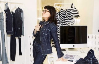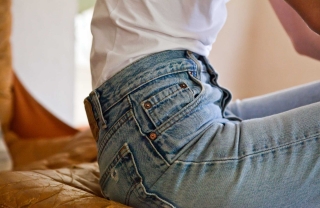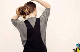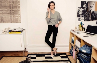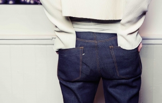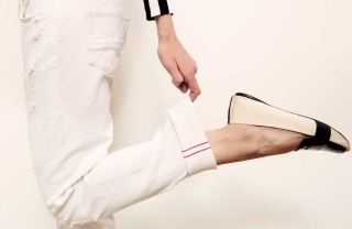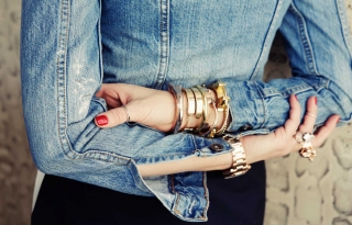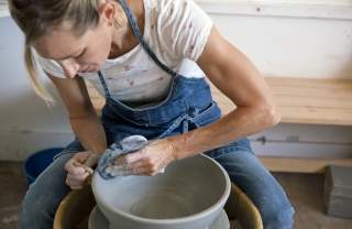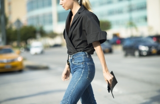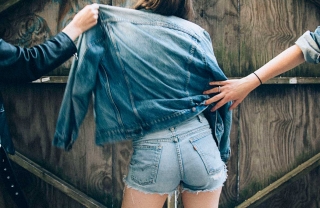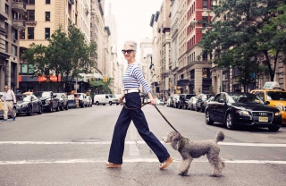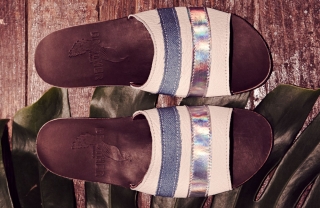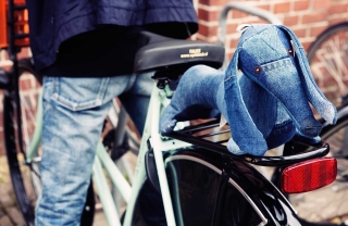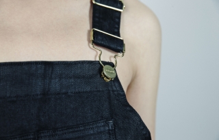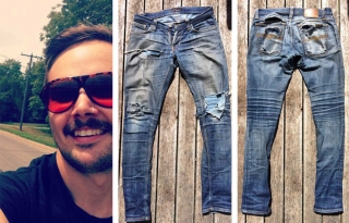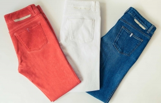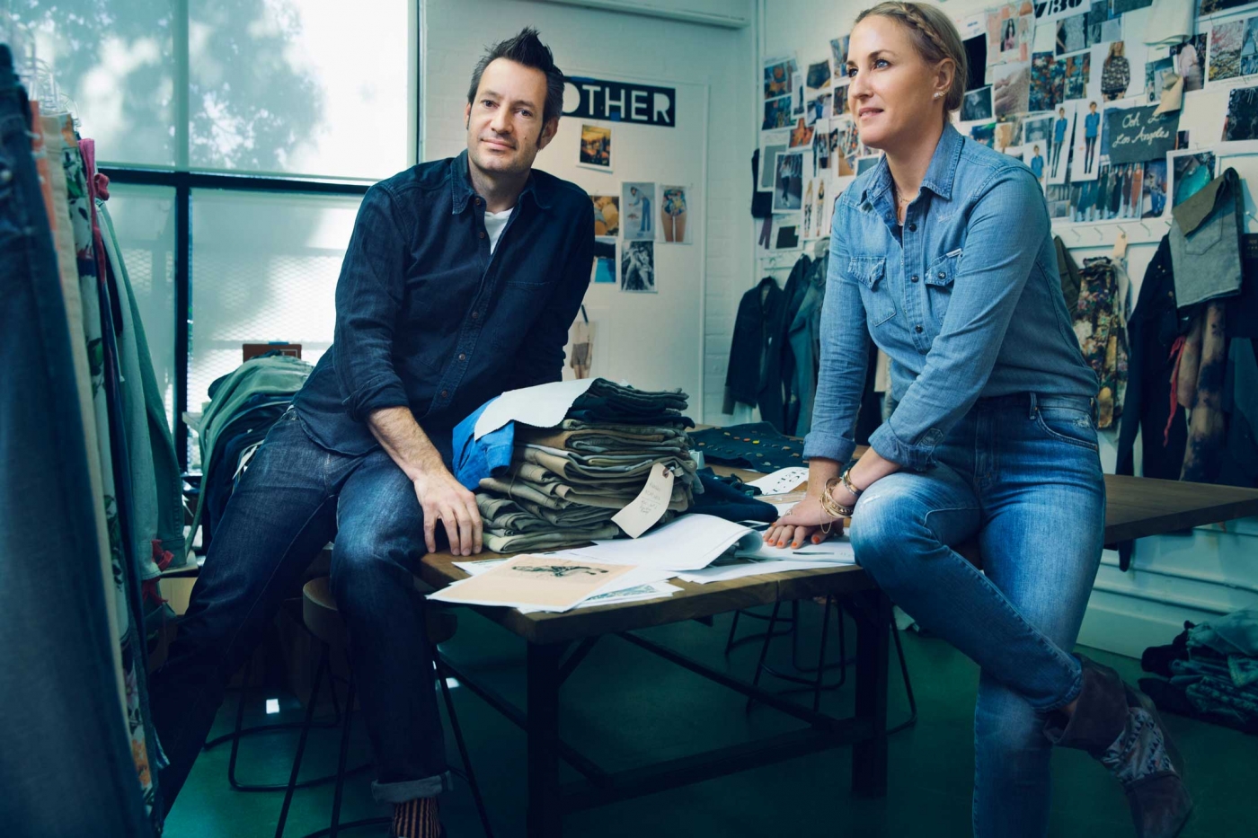
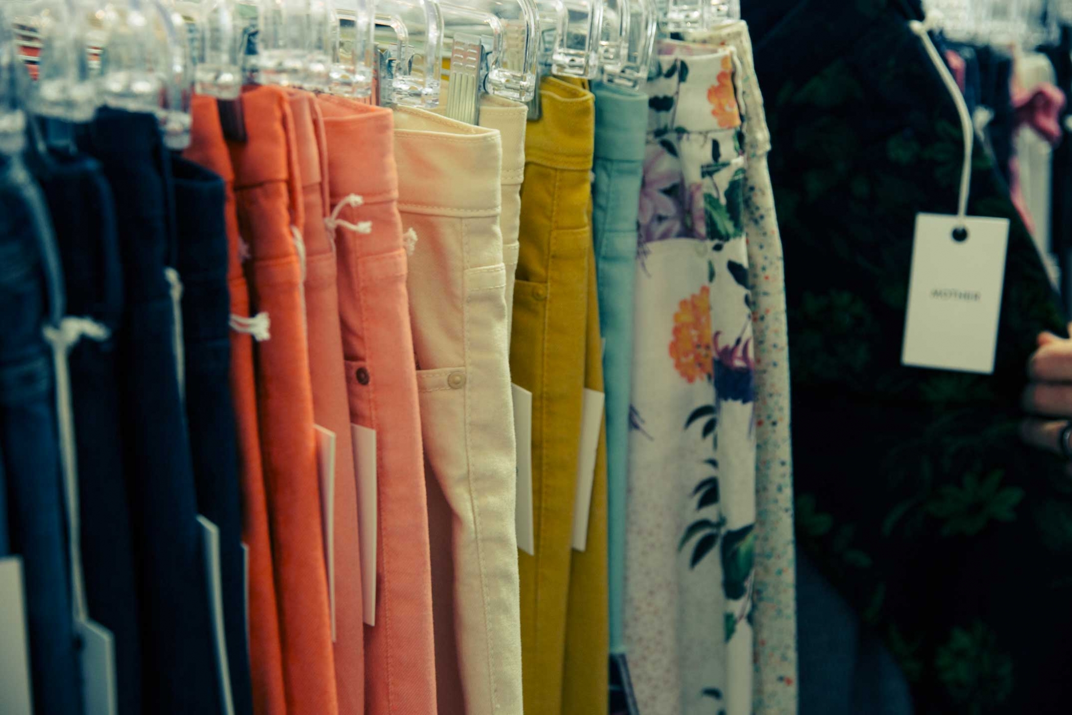
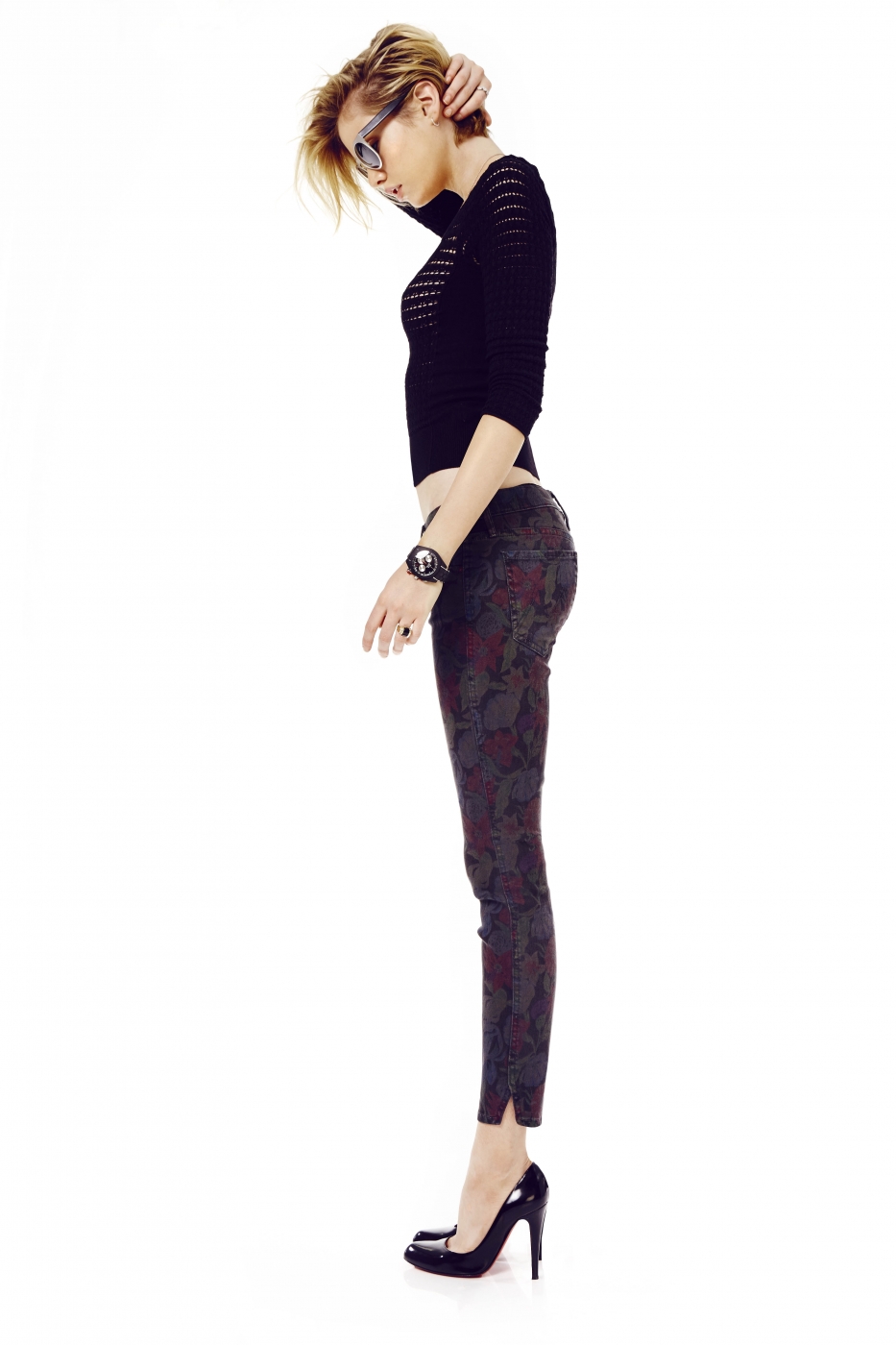
We know better than to judge a jean by its style name. But Mother, the Los Angeles brand co-founded by Tim Kaeding (designer) and Lela Tillem Becker (president of sales), sure got our attention with the witty and irreverent way they label theirs. Take for example The Looker, a favorite super-soft skinny that comes in rises high and low, and in new washes called Here Kitty Kitty and Bump in the Night. The Groupie (tapered with a higher rise) and The Vamp (skinny with an ankle slit) is done in a beautiful mid-blue rinse called Spiked Heels to Tractor Wheels. Dare I Be Happy? That’s code for black denim. Even the company name – Mother – is loaded, evoking teenage rebellion, unconditional love, and hilarious insult all at the same time.
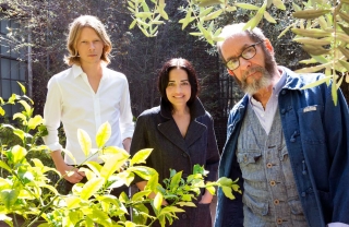
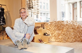
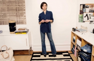
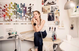
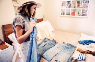
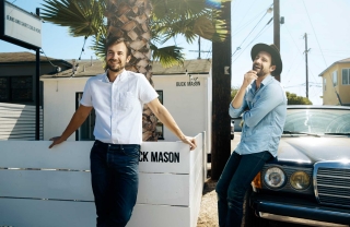
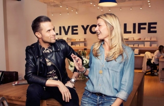
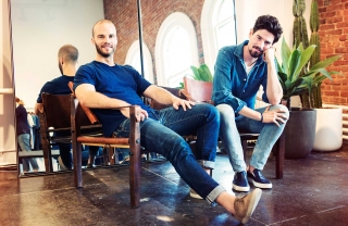
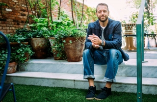
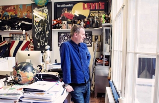
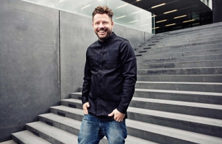
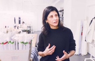
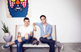
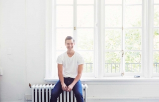
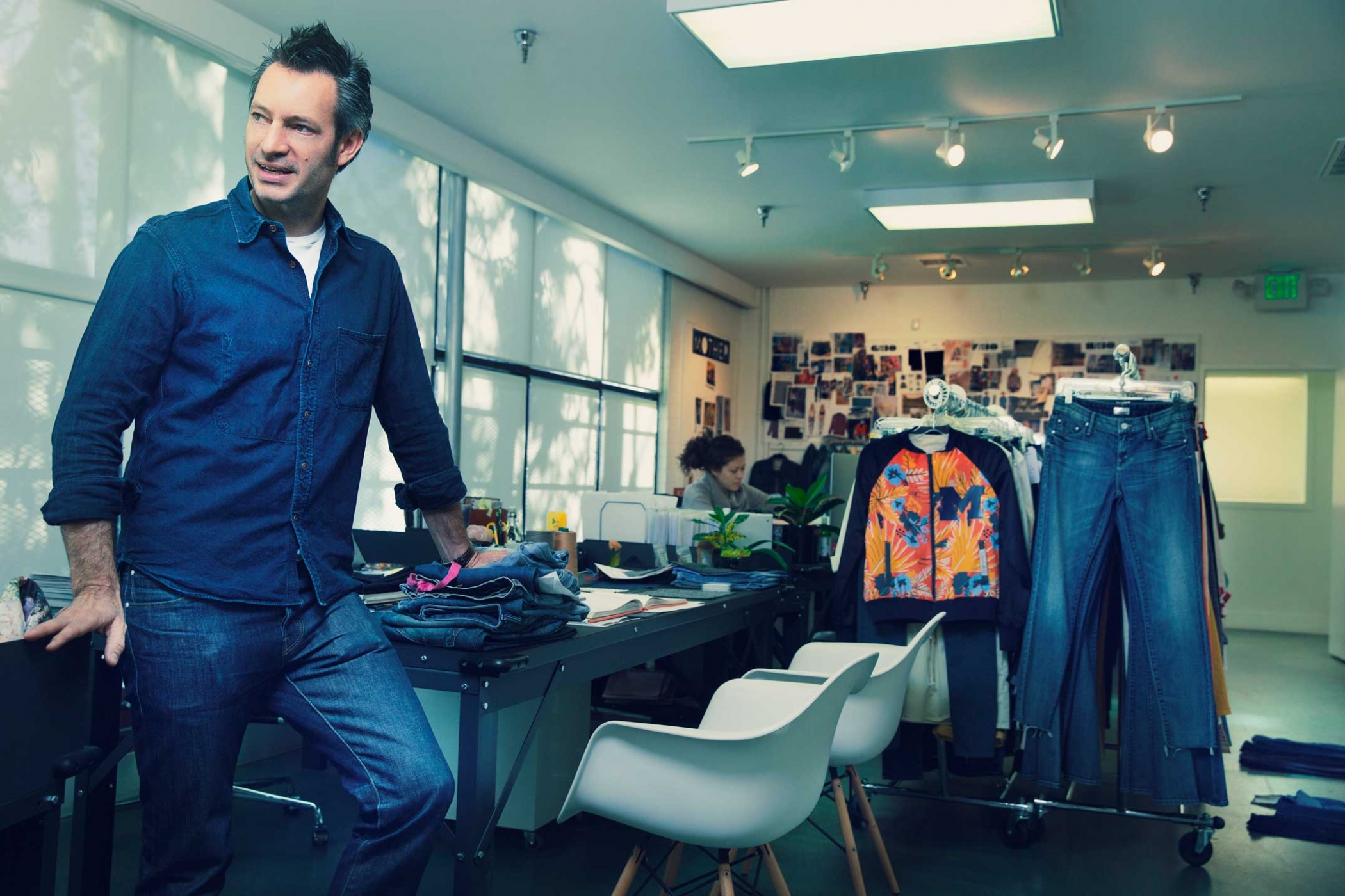
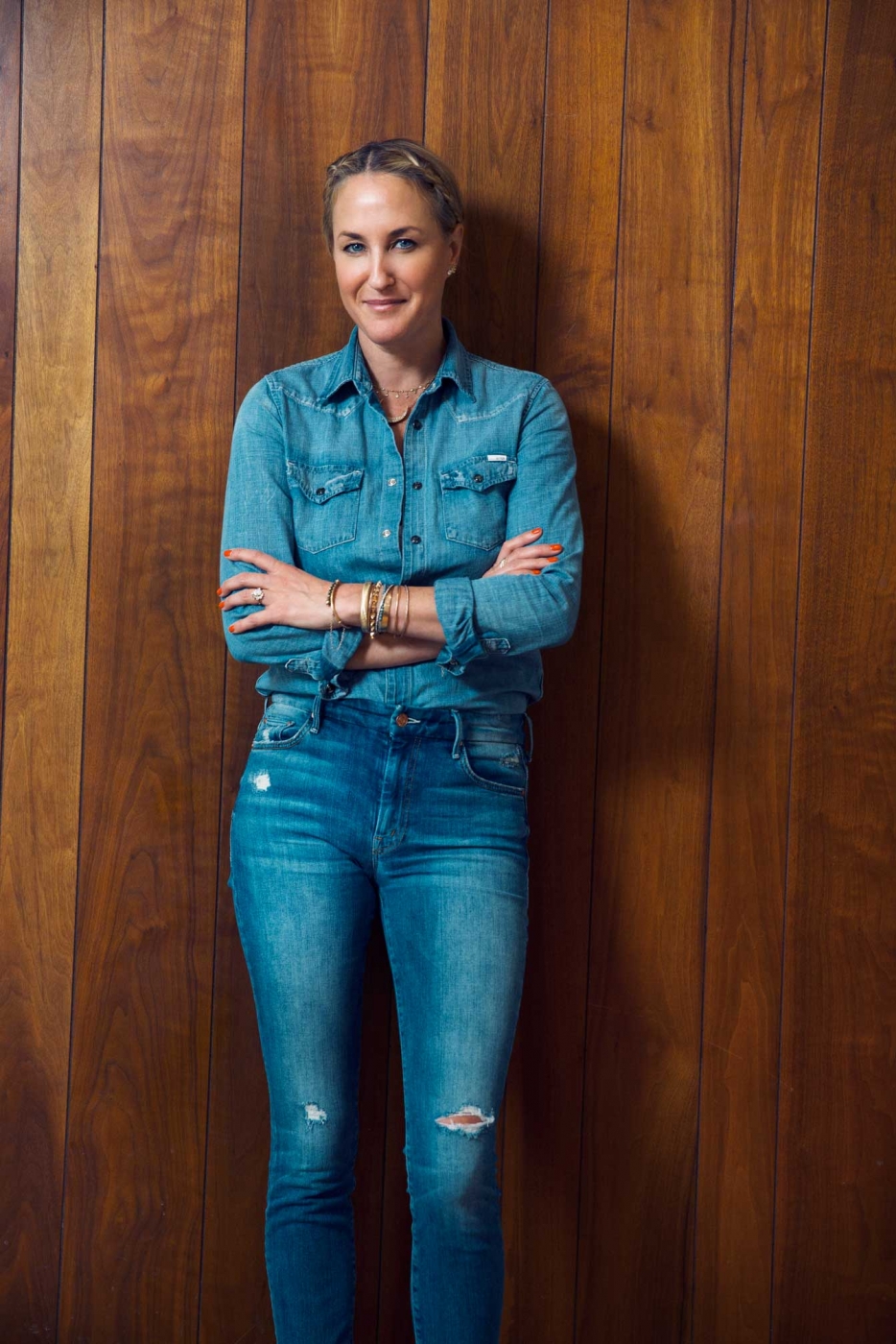
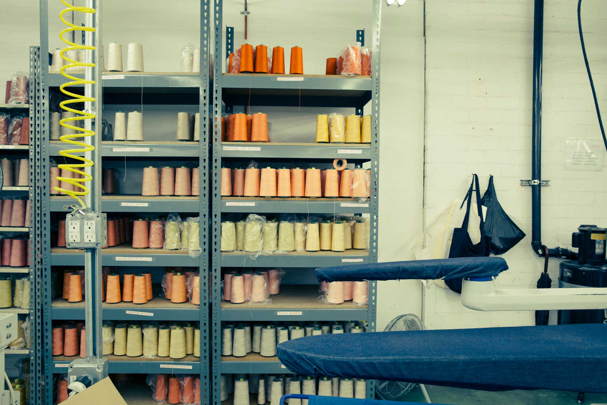
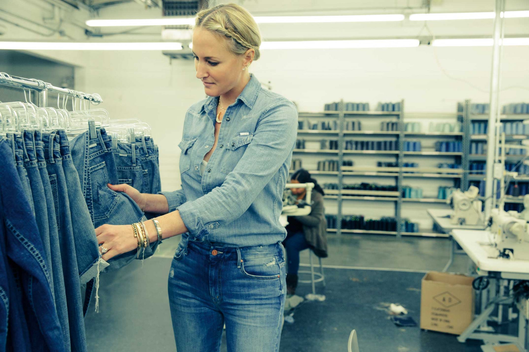
Make no mistake, though – Mother is no joke. Since launching in 2010 it has risen in the ranks of L.A.-denimland at an accelerated speed. Women love it because its so soft and bum-flattering. Editors love it because it has attitude, and because Kaeding, who once did design at 7 for All Mankind, and Tillem Becker, who came from sales at Citizens of Humanity, present a new color and print story essentially every month. We met up with the duo at headquarters, a super-70s warehouse/studio with a sample sewing room in the back, to talk, among other things, about the Night Moves, Magic by Moonrise, and Casual Weekend Fling coming this spring.
What does Mother stand for, as a brand? And how did you come up with the name?
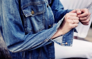
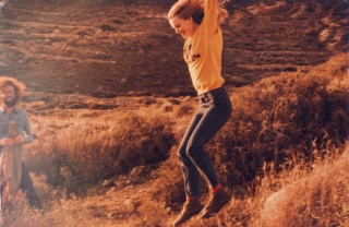
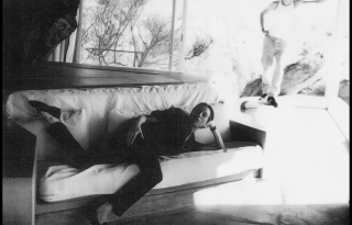
Tim: When we first started, the concept was really about soft, luxurious jeans. And the imagery was all black and white, hard-edged, almost uncomfortable. There was a girl in her underwear laying on a shag rug and it just said MOTHER. And it was like, Oh, whoa. You’d feel the jean and it’s super-soft…but the labels were patent leather, really hard. There’s always this play off of hard and soft. I really think we are the first company to say that we are all about super-soft jeans. They fit well – that’s what everybody does well – but nobody started out by addressing how they feel. Since then we’ve started doing different things. But that’s really where we began.
And the name played off the idea of duality. If you think about famous mothers in the world, everyone from Mother Theresa to the mom in Psycho, there are a lot of things you can do with a name like Mother. I liked the name because it was just one strong powerful word. It got a reaction. People were like, Oh what is that?
Lela: Some people thought we were about mom jeans, like Not Your Daughter’s jeans. Quickly we were like, No.
TIm: I like it when a word, a common word, becomes a brand and then everyone knows that word as that brand. 7 did that. Apple. To take a word and then change its meaning in everyone’s mind is an interesting thing. And we really designed the brand before we designed the clothes, for a year. We designed everything – the name, the font, the spacing of the fonts, the labels, everything. Before we made any product. I really wanted to make sure that there was a clear vision for the company before any product was made.
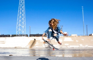
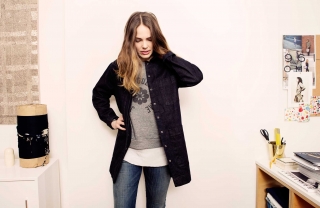
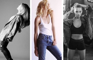
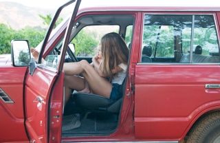
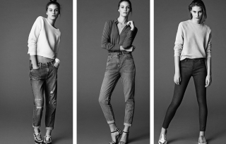
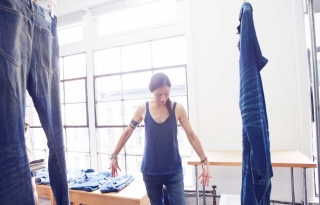
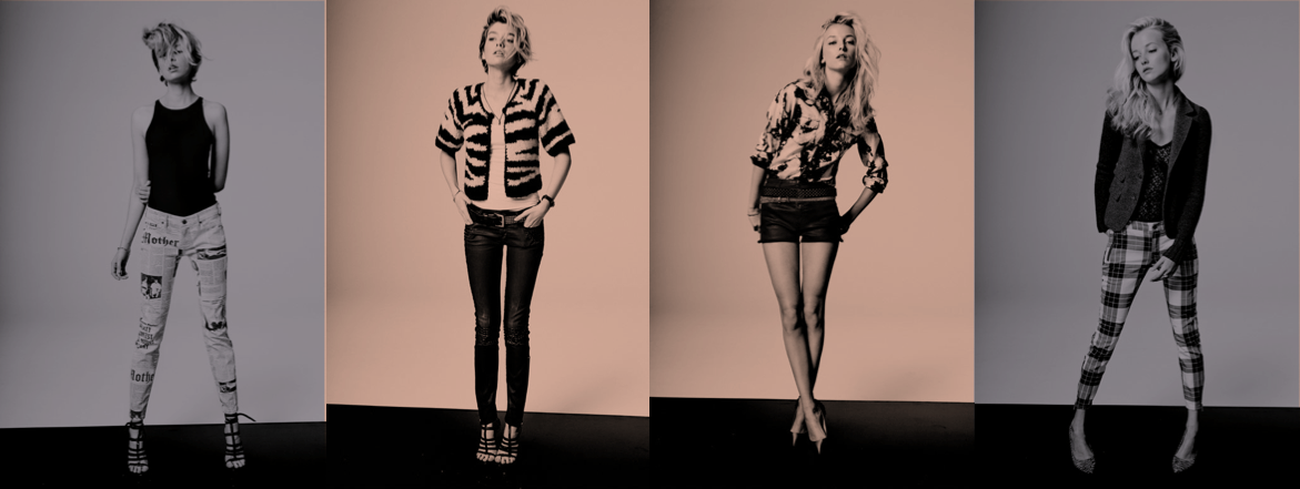
Click on an image to see the slideshow


How do you each choose which Mother jean to wear?
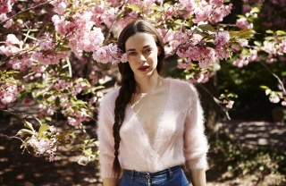
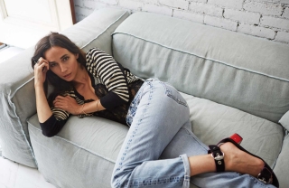
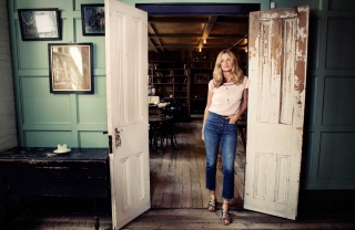
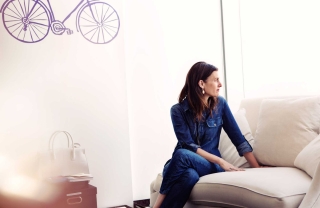
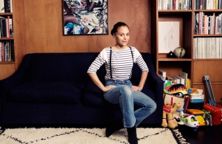
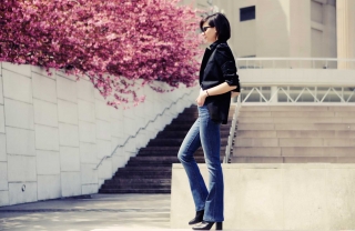
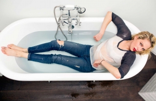
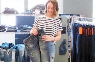
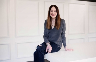
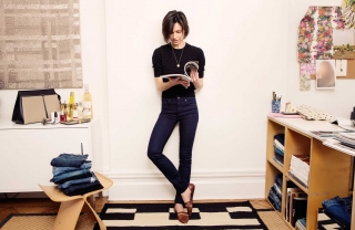
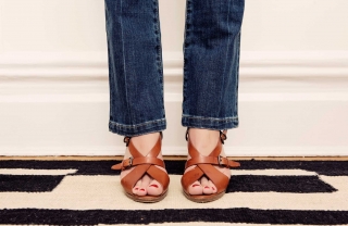
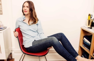
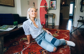
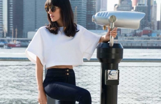
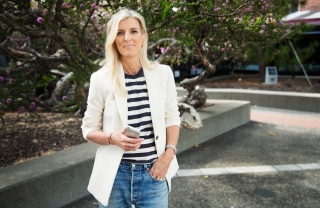
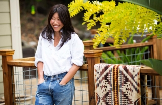
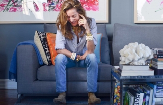
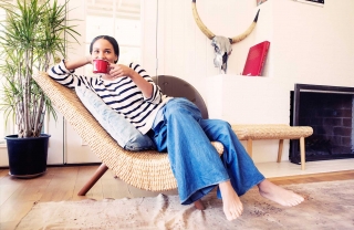
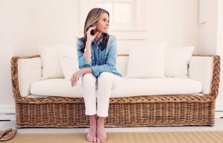
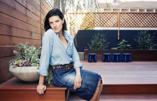
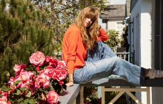
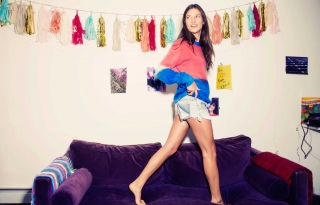
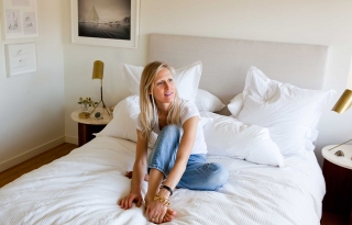
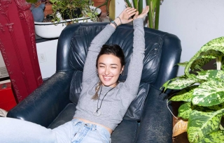
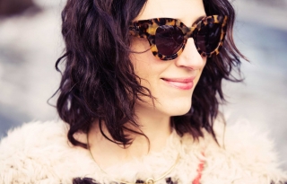
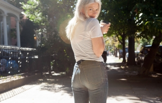
Lela: Well, I start eyeing them when Tim starts designing them. I love light light and medium washes, and I really gravitate to the light. I’ll take dark washes, but never as much. When I see what Tim is doing, I know if I want it. Right now I really like The High-Rise Looker. It’s short on me, because I’m 5’9″, but it isn’t meant to be cropped. The rise is always more important than the inseam to me. And my shirt is All My Ex’s in Whole Lotta Trouble.”
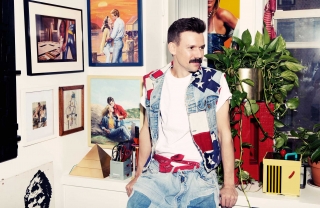
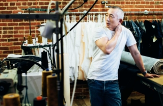
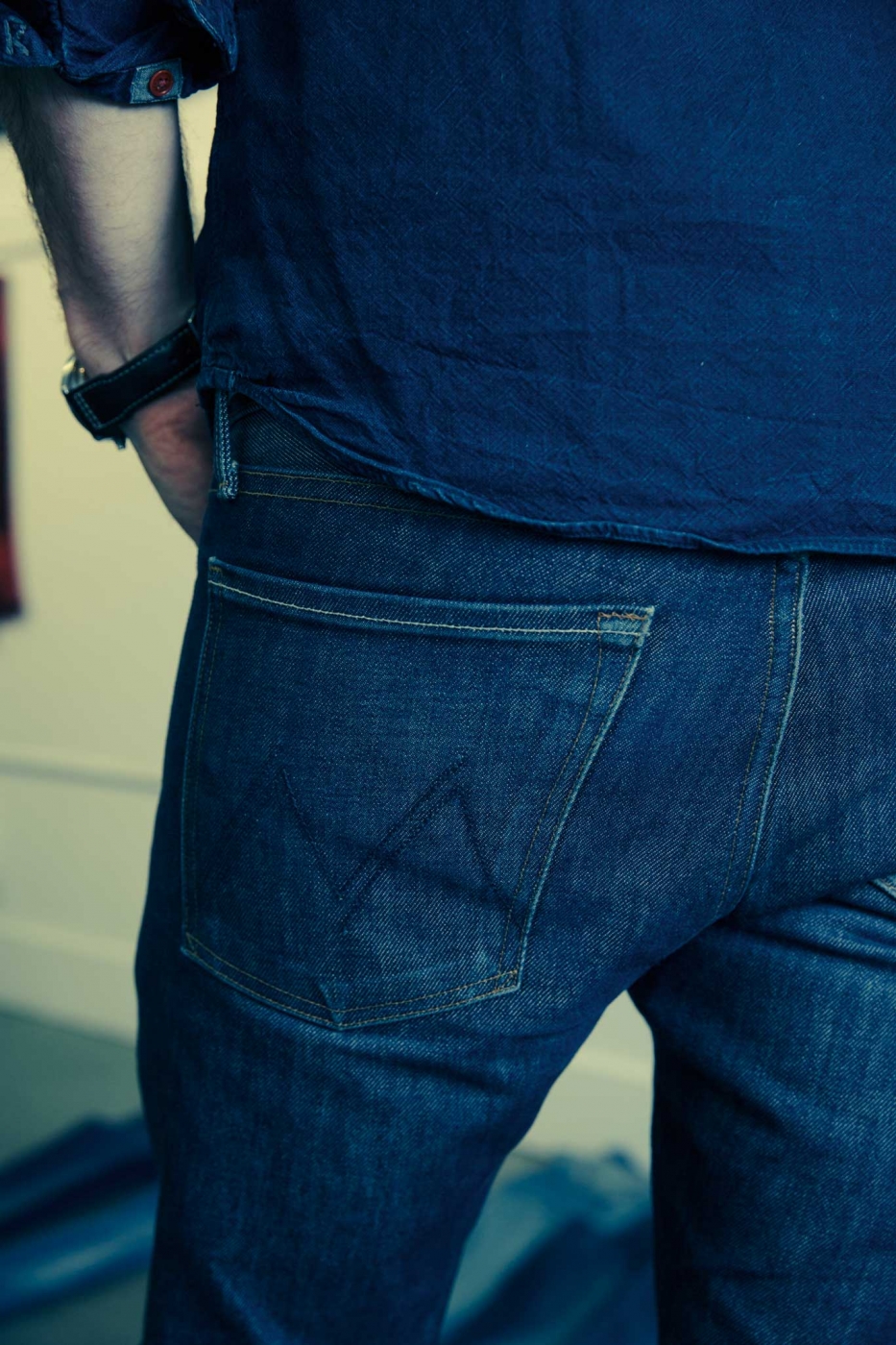
Tim: We don’t make men’s jeans, but I make a few pairs just for myself in the back sample room.
Tell us what you have going on this spring!
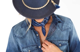
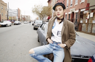
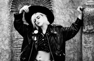
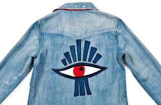
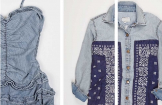
Tim: We do a different idea every month. For spring there’s camping, Hawaii, the punk stuff…So the styles in store in early January are transitional, between holiday/resort and spring. Generally it’s a smaller, tighter collection. This season we did a big run of brighter pastels, and I hate to use the word “Hawaiian,” but it was a little more floral-y inspired. My wife’s family is from Hawaii. We go to Hawaii twice a year – I’m like, Oh I’ve got a great idea: Hawaii! But it was really resort-y and floral-y. The end-of-January collection, which is the beginning of spring proper and going into stores now, keeps the same idea but gets a little more serious – the florals get over-dyed or bleached out. The idea was to keep the same concepts as the previous season and either mute them or blow them out to the extremes. We put some racing stripes along the side, too. In late February, the collection changes to Moonrise Kingdom – army green and camping colors. And 90s fits. So this shirt or this jacket is when you’re camping and you’re undercover trying to hunt bear [laughs]. This other one with the embroidery on it is if you’re camping and you’re on acid, which is the only way to camp these days [deadpans]. If you’re in the middle of Joshua Tree and you’re taking something, this is what you might see out there – bears and arrows and knives and eyeballs.
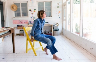
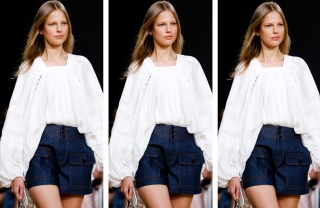
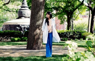
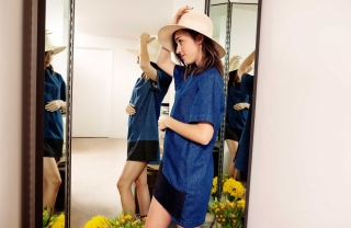
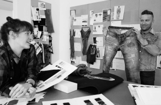
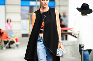
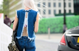
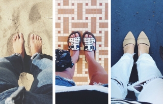
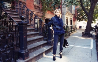
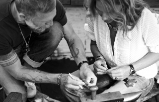
Click on an image for the slideshow and credit information


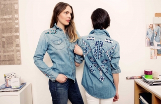
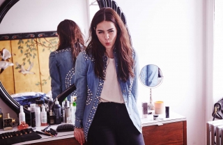
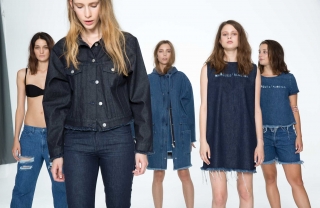
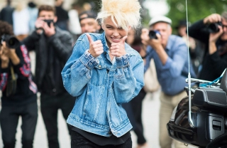
Tim: One thing I really love doing are little capsule groups. This season we did one that’s all punk stuff. Doing capsules allows us to do things that we wouldn’t normally do, like plaid pants, stuff like that. The first time we did it was with the Freja [Beha Erichsen] collaboration – it was a new fit, everything was stiffer, and it wasn’t what we do normally. Because it’s good to step outside the norm every season.
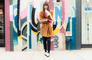
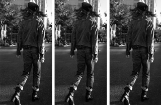
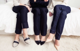
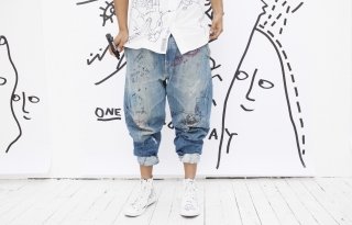
Looks from Mother’s Punk Capsule collection:
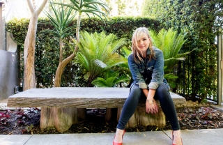
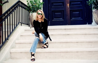
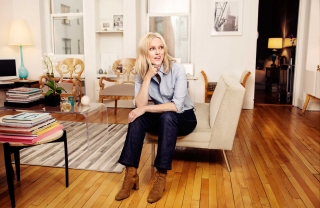
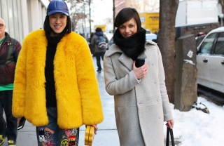
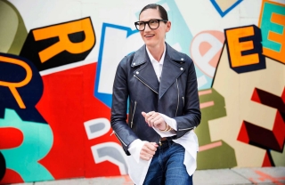
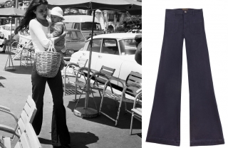
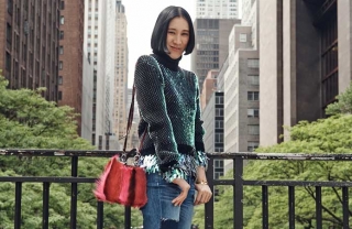
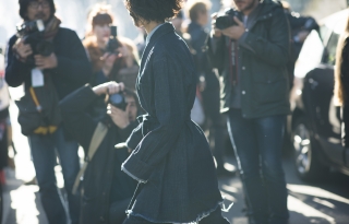
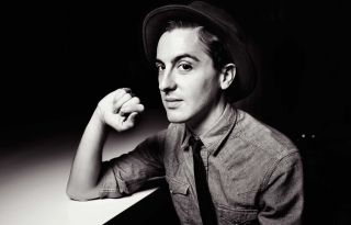
Related: Style.com’s executive editor Nicole Phelps in Mother’s Pixie fit.